Use short sentences
Short sentences are easier to read.
Don’t bombard visitors with big chunks of text. They won’t know where to start reading and won’t be able to digest your content.
Mix it up. If you need a long sentence, follow it with a short one. Variety helps.
 Try shorter paragraphs
Use paragraph breaks to your advantage. It’s okay to write longer paragraphs, but I like to keep my homepage paragraphs to a few sentences.
It’s also important not to overdo it. Too much of a good thing, is actually a bad thing.
Start each paragraph with new information, so if someone is scrolling they can quickly tell if they need to read that paragraph.
 Choose a color scheme that fits your branding strategy
The color choices you make on your website are more important than you think.
Visitors judge your website in less than 90 seconds. Most of that is a result of the colors you choose.
The best way to choose your website color scheme is with branding. Refer to your logo. Do the colors on your website fit with your brand image?
Here’s an example. Think of Starbucks.
When you hear this brand name, I’m sure you have an image in your head. Maybe it’s the logo, a sign, or a store location.
Do you associate any colors with that name? Now let’s look at their website.
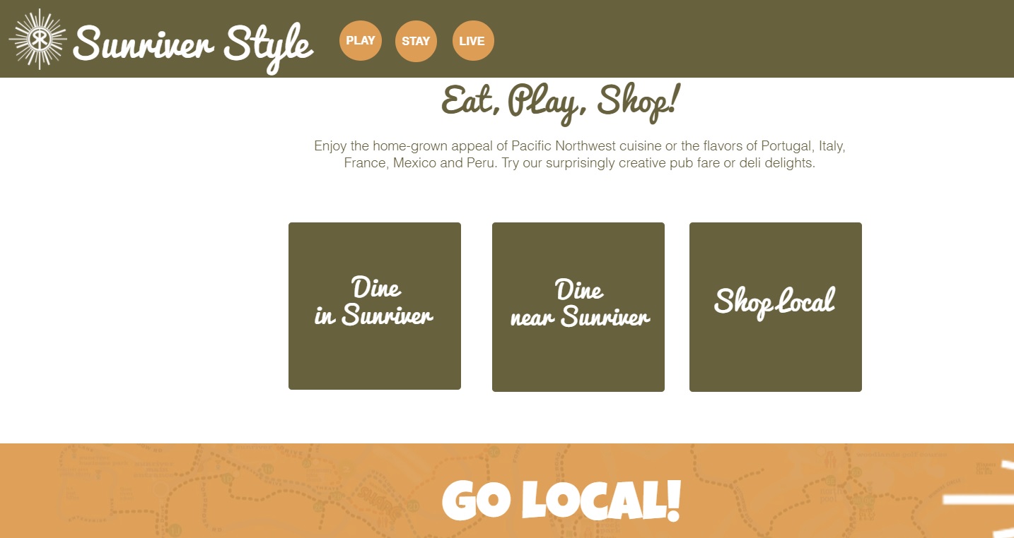 Simplify the navigation
It shouldn’t be difficult for a website visitor to find what they’re looking for on your site.
Put yourself in their shoes. Why are you visiting the website? How do you accomplish that task? Maybe you want to buy something, get more information, or see what there is to offer. Whatever that reason may be, if visitors can’t figure it out quickly, they’re going to leave.
There is just too much competition out there. Users have no reason to put up with unwieldy website navigation. All they need to do is leave your site and find what they need somewhere else.
Don’t try to reinvent the wheel with a complex design. Stick with the standard format.
For example, most websites put the navigation menu horizontally at the top of each page. If your menu is somewhere else, it might confuse your visitors.
The fewer options in the menu, the better. Otherwise, it will be too hard for people to find what they need. This concept is known as Hick’s Law.
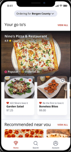
 Optimize your design for mobile devices
Mobile is how the majority of the world accesses the Internet. That means if you’re not optimized for mobile, your website is not going to perform well.
Take a look at this data from Hootsuite:
Search engines recognize this and reward sites that are mobile-friendly. Here are a few more stats to hit the point home:
Google knows that 87% of smartphone owners use their devices to run an Internet search at least once per day.
58% of all Google searches are done from a mobile device
The result: 70% of the first page results on Google are optimized for mobile devices.
Mobile SEO is the most important thing you can do in order to rank well on Google. Seriously.
If your website doesn’t look good on a smartphone, people won’t want to stick around. So, make sure your website designs are mobile-friendly.
Go deeper: Want to learn how to optimize your website for mobile? Check out our complete guide to a mobile friendly website.
 Show, don’t tell
Visuals not only help you break up the written content, but they can also provide deeper explanation. Show your visitors what you’re about. They’ll understand more in a shorter amount of time.